How to Design & Deliver High Impact Presentations: Before & After Examples
/By Dr. Barrett Mosbacker
Leaders make presentations. Transformative leaders deliver inspirational, informative, and persuasive presentations.
Good presentations are hard to design and deliver, which is why we have suffered through so many poorly delivered seminars and workshops. Although I like to think of myself as a decent speaker and presenter, the truth is that I’ve given my share of poor keynotes and boring seminars.
Fortunately for those who must listen to me (my staff) and those who will do so voluntarily during conferences, graduate classes, and workshops, I’m improving. My growth in giving higher impact presentations is the result of reading articles and books, the critique of others, and trial and error. I offer the following tips with the hope that you can benefit from my reading and experience.

image
PREPARATION
Preparation Time
The amount of time that you spend on your presentation will vary based on the subject and context but in general, a 30-60 minute high impact presentation will require 36-90 hours of preparation. You read that right; a quality one hour presentation = 36-90 hours of preparation.
Presentation authority Nancy Duarte, author of the book Slideology and principal at Duarte Design (clients include Apple, Cisco, and Al Gore among many others), puts it this way; “The amount of time required to develop a presentation is directly proportional to how high the stakes are.” Duarte goes on to provide this guidance:
6-20 Hours Research and collect input from the web, colleagues, and the industry
1 hour Build an audience-needs map
2 hours Generate ideas via sticky notes
1 hour Organize the ideas
1 hour Have colleagues critique or collaborate around the impact the ideas will have on the audience
2 hours Sketch a structure and/or a storyboard
20-60 hours Build the slides in a presentation application
3 hours Rehearse, rehearse, rehearse (in the shower, on the treadmill, or during your commute)
Total Time: 36-90 hours
Is that accurate? Thirty six to ninety hours for a one hour presentation given all that I have to do? For what it is worth, that has been my experience lately. It takes a long time to prepare a good presentation. I have spent hours over several weeks preparing and designing presentations.
You are a steward not only of your time but of your audience’s time as well. Don’t waste your time or theirs by giving a poorly designed and delivered presentation. Don’t abuse your audience with a mediocre presentation.
I recommend that you schedule time throughout the week for several weeks to prepare your presentation. Your preparation time will be more efficient if you work on it in small, frequent chunks over an extended period of time.
Know your Audience
Your presentation is not about you; it is about your audience and what they need to hear, learn, and/or do. Your presentation is a service to them.
To serve your audience well you need to know them and their perceived as well as real needs. If I am speaking to an outside group I make it a habit to ask my host the following questions:
How many will be in attendance?
What is the average age?
What is the average educational level?
What will be the gender mix: balanced, mostly women, mostly men?
If this is a school audience, are most in attendance teachers, administrators, board members? If all three, in what proportion?
What are the primary areas of interest or concern of this audience regarding this topic? What are some of their likely questions?
Tailor your presentation to your audience. The stories you tell, the examples used, and the graphics employed should match the demographics and needs of your audience. Otherwise your presentation will be largely irrelevant.
Know the Venue
To prepare properly you need to know the venue and to request things that you may need. I typically ask:
What type of room/auditorium will I be in?
What type of sound and video equipment will be available?
Will I be controlling my slides or will you have an AV tech. assisting?
Will there be a podium mic? May I use a lapel mic.? (I prefer a lapel or head mic so that I am not restricted to standing behind a podium.)
I am using a Mac/Windows PC, can I load my PowerPoint/Keynote presentation on the local computer or do I need to have my computer on the platform?
SLIDE DESIGN-Less is MORE!
Less is MUCH MORE! This is probably the most important lesson I have learned from my reading and my experience. Keep it simple, clean, and elegant. Remove everything that is not absolutely necessary on your slides and charts.
Less is more-fewer slides, fewer points, less text, and less time.
This is harder than it seems! We want to add information, not eliminate it. When designing your slides keep the following in mind:
You want to talk to your audience and you want them to listen and watch you. You do not want them reading slides!
Slides are NOT a teleprompter! Do not design and use slides as an outline of your talk.
Slides are used to illustrate key points. They should be simple, clear, and uncluttered.
Eliminate most transition effects--they distract from your presentation.
Have few to no bullet points.
You should seldom have more than six to eight words on a slide.
Use large easy to read font.
Use consistent font styles and colors.
Do not use clip art! It is cheesy and unprofessional. Find good photographs or graphics.
You should seldom use template designs for the same reason--they are distracting. Here is an example of a distracting verses a good slide template:
Distracting Template:
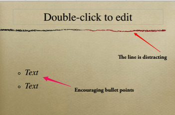
image
Good, Clean Template:

image
Good and Bad Examples
Assuming that a “picture is worth a thousand words,” here are some examples of before and after designs. Many of these are slides that I have produced--both good and bad and a few are provided from other sources as examples. My slides are indicated by the initials BLM.
THE BAD
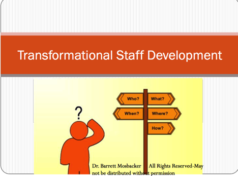
image
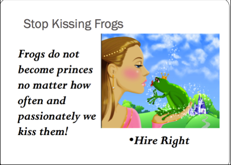
BLM (Cheesy clipart, poor color selection, distracting text)
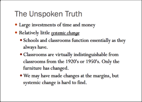
image
BLM (Boring with no graphics or illustration, small font, too many bullet points)
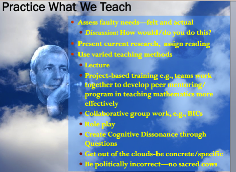
image
BLM (This one is so bad it is just embarrassing. There is nothing good about this slide. The graphics are terrible. Too many bullet points. Font too small. Poor color selection.)

image
BLM (The slide has too much text, which is too small. The illustration is poorly done and the overall impact of the slide is boring and distracting.)
image
BLM (The slide has too much text and cheesy clip art.)
THE BETTER
Here is the same topic being covered with a redesigned slide from the one above.

image
BLM (This one has no clipart and no text. A high quality photo covering the entire slide is used. The photo speaks for itself. It is much more impactful than the one before with the same point to make.)

image
BLM (This title slide is affective because the professional photo reinforces the title, which is very short and to the point. The photo also matches the audience, this presentation was given in Canada in the winter.)

image
BLM (One word with a photo matching the key concept.)

image
BLM (Transition slide to next topic--simple text on solid background)

image
BLM (This is a playful slide using a professional photo but with a font matching the playful mood. This slide was designed to communicate with and encourage elementary teachers thus the colors and playfulness, which are characteristic of elementary programs.)
The following five slides tell a story and reinforce each other.
Slide 1 acknowledges how many feel when faced with significant change.
Slide 2 encourages the audience to laugh and relax because we will provide time and resources to ensure their success.
Slide 3 reassures that we are confident that they will be successful as a team.
Slide 4 reassures that we are confident of success because….
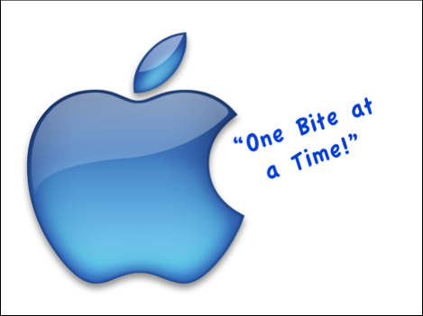
Slide 5 communicates that we will deal with big change in small bites.
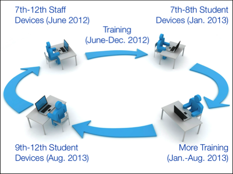
Slide 6 illustrates why they will be successful--a slow, deliberate training and implementation cycle.

image
BLM Slide 1

image
BLM Slide 2

image
BLM Slide 3

image
BLM Slide 4
image
BLM Slide 5
image
BLM Slide 6 This slide has animations so that each date appears and disappears in sequence.
A Word About Charts and Numbers
Charts can be very helpful in a presentation but just like your slides they need to be simple with all distracting and unnecessary elements deleted.
Numbers are usually confusing to the audience. Use as few as possible and allow extra time for the audience to do the math. Numbers should never be ultra precise: “Anticipated revenues of $660,101.83” looks silly. Are your numbers that accurate? Just say $660 thousand.
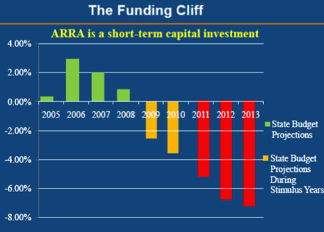
image
This is a busy, hard to read and understand chart with too many words and numbers.
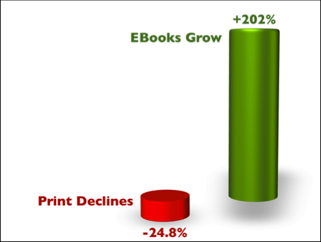
image
BLM This chart is much better. Easy to understand, clean with no distracting elements, e.g., grid lines, unnecessary numbers, and text.
DELIVERY
Arrive Early and Test Everything!
It is stressful and embarrassing to stand up to deliver a presentation only to discover that something is not working. Worse, it is distracting to your audience and immediately reduces your credibility and impact.
You only have about 1 minute to make a first impression. Don’t make it with you trying to get your computer to work or your slides to show up on the screen.
Plan for Murphy to show up. He always does. Plan for the worst case scenario. What will you do if the computer crashes and burns, the video system goes out, or the sound system does not work? Prepare for the unexpected. When you do, you can go with the flow and not skip a beat.
Have your presentation so well rehearsed that you do not need slides as prompts (more on this later). You should be able to speak spontaneously. If you can’t, you don’t know your subject well enough.
If you must have notes, have a printed copy readily available.
Have electronic backup copies of your slides on a thumb drive (for use on a local computer if yours crashes) and your online for immediate download if needed. I use an iPad for this purpose.
Have copies of your notes and slides available for distribution or access online.
Talk to Your Audience, Do Not Read!
Whatever you do do NOT look at your slides and read from them! Keep your eyes on your audience. Make eye contact with individual audience members.
Remember, your slides are to illustrate key ideas, concepts, trends, and facts. Do not use your PowerPoint or Keynote presentation as a teleprompter.
Presentation Style Tips
Remember, your audience will form a first impression within 60 seconds or less! Make that first minute count!
Dress appropriately for your audience. It is best to “dress up” rather than “down” if in doubt.
Tell real life stories that reinforce your topic.
Turn off your cell phone.
Jump right in and get to the point.
Give your rehearsed opening statement; don't improvise at the last moment.
Use the opening to catch the interest and attention of the audience.
Briefly state the problem or topic you will be discussing.
Talk at a natural, moderate rate of speech.
Project your voice.
Speak clearly and distinctly.
Speak with enthusiasm.
Use appropriate well timed humor but not jokes.
Pause briefly to give your audience time to digest the information on each new slide.
Keep your eyes on the audience.
Use natural gestures.
Don’t turn your back to the audience.
Don’t hide behind the lectern. As much as possible don’t use a podium at all but if you must or the host site has it there for other speakers, move in front or to the side.
Avoid looking at your notes. Only use them as reference points to keep you on track. Talk, don’t read.
Length
To end on time, you must PRACTICE!
The audience will love you if you end short of your time. Never go over! Remember, less is MORE.
As a rule of thumb, plan to use 80% of your allotted time.
Demeanor
Show enthusiasm. Nobody wants to listen to a dull presentation. On the other hand, don’t overdo it. Nobody talks and gestures like a maniac in real life. How would you explain your ideas to a friend?
Recommended Reading
All truth is God’s truth. We can learn from unbelievers because by God’s common grace he reveals truth to believers and unbelievers alike. Although I do not endorse everything in the following books (e.g., some have Buddhist and Zen philosophy embedded in them), nevertheless, some of the principles are true and can help anyone design and deliver better presentations.